
I love delving into the past and researching for design. Amy and Peter asked me to create their 1930s inspired wedding stationery, my brief was Fred & Ginger and champagne saucers.
The 1930s was a period of extremes from the great depression and World War II to the huge boom in radio and motion pictures. Going to the movies was an escape from life's daily struggles and for a brief moment you could escape into a glamorous and romantic world. In the black and white films they had to use lots of texture to create contrast so feathers, shiny silk and sparkles where found in abundance. In the early 30s white was a trend colour in fashion, interiors and if you were rich, a white car. This led to off-whites and soft pastels becoming popular, glamourise even more by the satin gowns worn by the Blond Bombshell.
Typography in the 1930s was still heavily influenced by Art Deco which can be seen in these fantastic movie stills here. It was amazing, with a bit of research, of how many fonts I held that were designed in this period or a modern interpretation such as Kaufman Script, MonoLine, Hardwood and Mona Lisa to name just a few. Geometric sans serifs influenced by the 1920s Bauhaus movement such as Kabel, Futura and Gill Sans were introduced but not typical of the 30s.
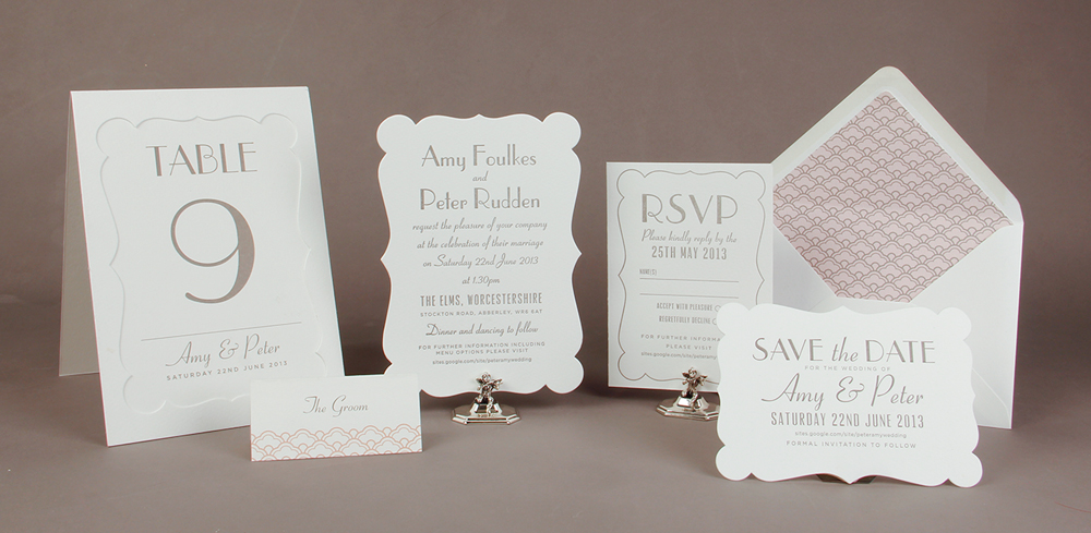
Here's the final design, elegant with a hint of Art deco which Amy and Peter where delighted with. The die-cut shape and envelope liner adds some glamour and the off cuts from die cutting the stationery where used to make the table numbers and large table plan.
To see more images you can view ASTAIRE here